


We’re Swapping Gallery Walls for Asymmetrical Art Placements in 2025
So you’re trying to style a large blank wall and conventional wisdom would tell you to fill the space with a gallery wall of art or photographs — but we’re here to tell you that we think a small piece of art with unexpected placement may be more compelling. Let’s talk about this rising trend and how to execute it flawlessly.
A shift is happening in the interior design world and you’re about to start see it pop up all over social media. Instead of the perfectly aligned and spaced artwork we’re accustomed to, a new trend is emerging – off-center, smaller scale art. Off-center art is all about embracing asymmetry and breaking free from the constraints of traditional aesthetics, especially as more traditional patterns and styling are coming back on the scene.
So how are we using it in client homes and what makes it look elevated instead of awkward?
Traditional gallery walls had their moment
Like skinny jeans, gallery walls have been on trend for over a decade. We’ve seen them used above console tables in an entry way, down a long hallway displaying black and white family photography, and even displaying sports memorabilia in a game room. The advantage to a gallery wall is that you can fill a large, blank wall fairly easily through continuing to add to the collection of frames.
Now, we’re not saying you’ll never see us use them again BUT we are noticing that utilizing one intentional piece of artwork in an unexpected way can feel much more curated and elevated.
Benefits of off-center art and unexpected placement
In a world where our minds are constantly cluttered by notifications and busy calendars, it’s a fresh approach for your home that reduces visual clutter. I’m not saying your home needs to feel empty or be minimalistic in all aspects, but this new approach gives your eye a moment of rest. I still love a layered look on a console table or a nightstand but this off-center art trend is all about decor balance.
It also is an opportunity to invest in singular pieces that you adore instead of spending money on the 10 frame set and printing graphics you purchased from Etsy that will inevitably need to change in a year or two. In the same way we’re seeing capsule wardrobes in the fashion world, I’d argue this off-center art display will be propelled forward by the same mindset of purchasing with the long-term in mind.
How to create an off-center art display
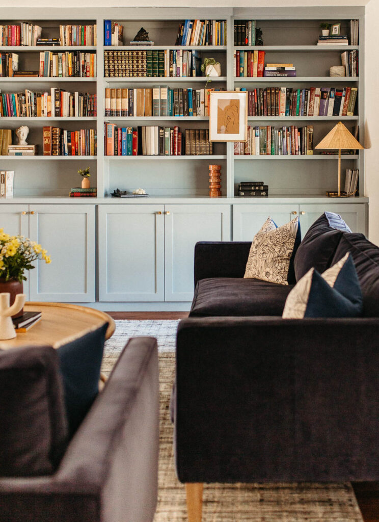
The first thing to keep in mind is the concept of anchoring. This will ground the smaller piece of art and help the off-center placement not look out of place. You can use wall lines, console tables, bed frames, a sofa.. really anything that visually gives a reference point. In the image below, we used built-in book shelving to anchor the art that’s placed a third of the way from the wall. It doesn’t feel awkward but catches the eye in an eclectic way.
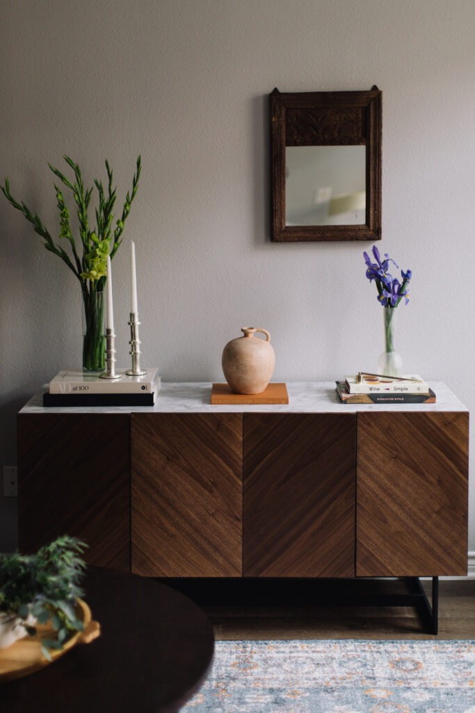
In order for the space to still have a sense of balance, use other accessories around the off-center placement to create a dynamic display. You can place an off-center piece of art at one end of a console table and then use a large vase on the other end to create the appearance of symmetry.
Lastly, don’t be afraid to play with the placement. If you’re going to commit to off-centered art, it needs to be intentional enough that it doesn’t look like you measured slightly off. Make it interesting and commit to the scaling. If you’re having a hard time knowing exactly where to place a piece, use temporary methods of hanging so you can live with it a couple days before the more permanent nail in the wall.
Choosing the right artwork for off-center display
Unlike a gallery wall that can work in a rainbow of colors through a number of pieces, for an off-center artwork display, the singular art piece needs to intentionally speak to the rest of the decor. I like to ask if this were an oversized piece of art with the same imagery, would it work in this space? It doesn’t have to match but definitely should complement or create a visual story.
Another helpful way to make the art hold its own in an off-centered placement is giving it interesting and substantial framing. Here’s a frame we’re loving that can help a smaller piece of art stand on its own.
Exploring off-center art in other interior designers work
Kelly Wearstler is the master when it comes to off-centered art placements. If you look at her portfolio you’ll see art hanging in the most interesting of places with dynamic color stories. In her designs, a snapshot of an isolated corner may look random but with the layout of the rest of the room, your eye moves from one interesting moment to the next.
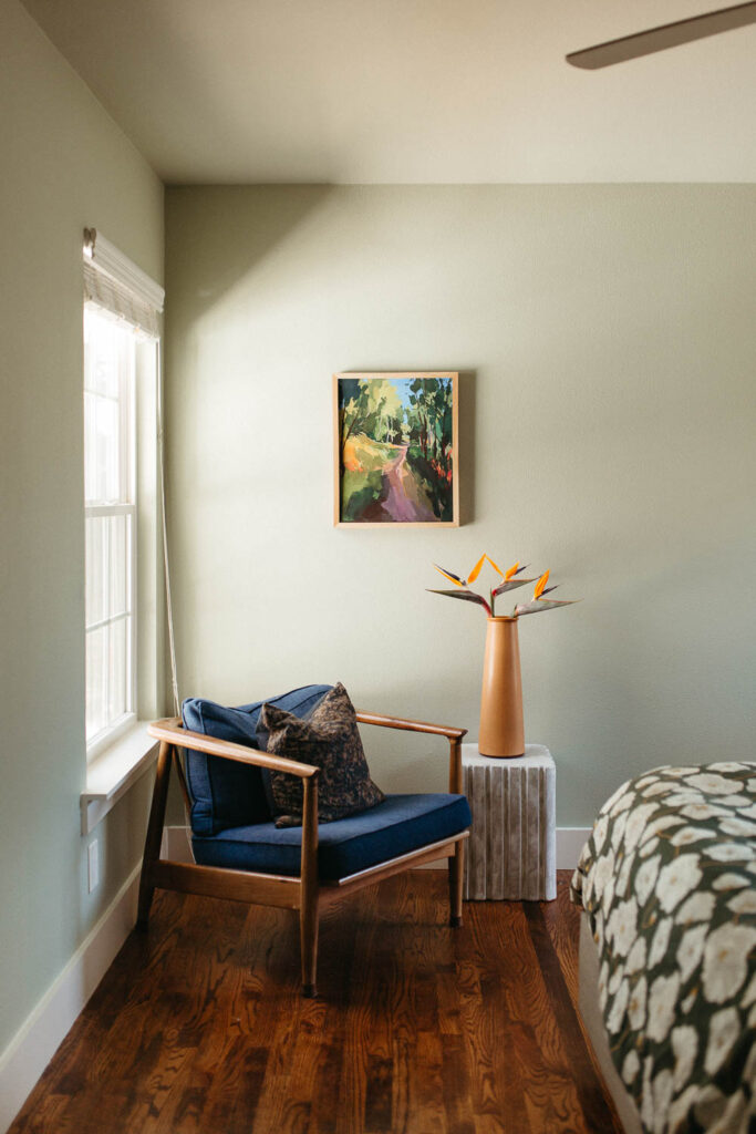
A common moment we’re seeing this off-centered art captured is above a bed frame. We’ve seen designers like Amber Lewis in her Four Hands collaboration, Sarah Sherman Samuel with Lulu & Georgia, and Jake Arnold all use this approach to create more interest in the bedroom.
Conclusion: Embracing the future of art display
We are seeing the resurgence of traditional home decor coming back on the scene: from pleated lamp shades to floral wallpaper. Designers are reinventing these older styles with unexpected tricks like pattern drenching, pops of color, and off-center art displays.
Whether you’re wanting to create more visual rest in your home or trying to create dynamic displays, there are countless reasons you should give off-centered art placement a try in your home.
Sincerely,
HMD

