HMD specializes on renovation projects that honor the home's character while adding a modern interpretation.
Explore The Blog
Home Rennovations
Do-It-Yourself
Home Styling
Favorite Things
Case Studies
How to Create a Sophisticated Monochromatic Designed Space
Do you ever look through a magazine and see a boldly designed room but think there’s no way you could achieve the same look in your own space? White and gray walls have their place but in my opinion, they have a hard time competing with a room full of warm tones.
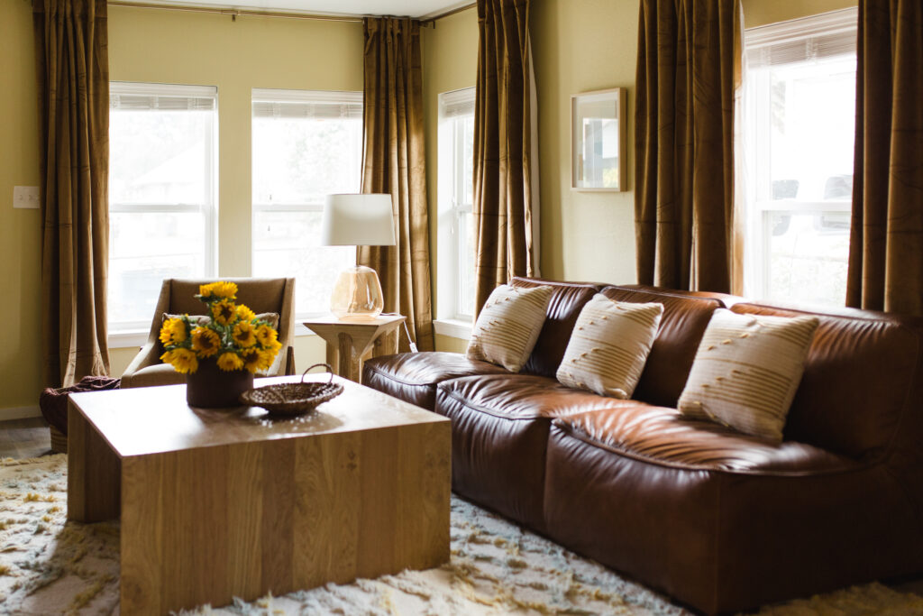
So if you like the look we created for this fun Airbnb, below are some tips to create a similar look in your own home!
1. Focus on color tones
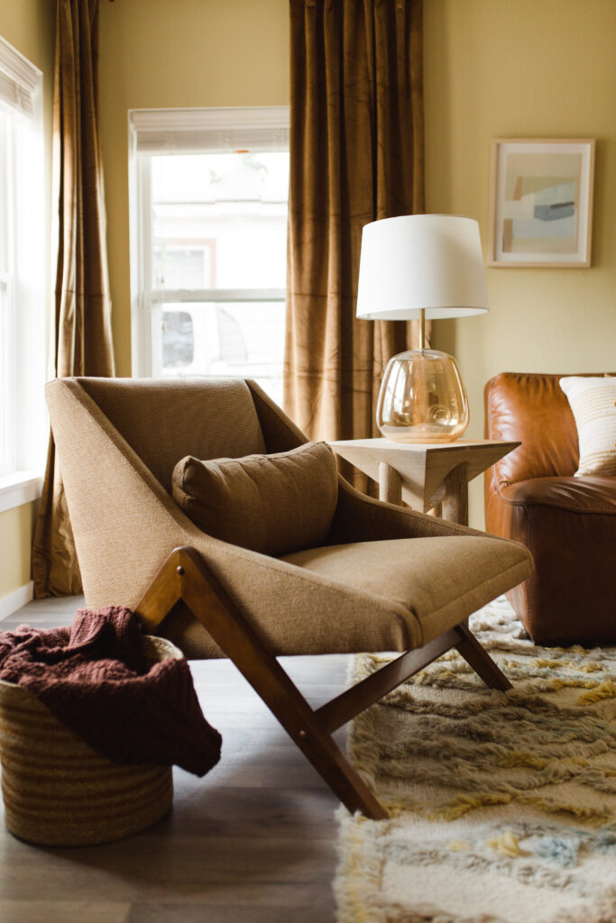
While monochromatic is defined as having tones of one color – it’s so important that you choose a sophisticated color to anchor the design. For this home we used a golden yellow with natural wood tones, hunter green, navy blues, magentas and grays in 5 different schemes.
What makes a color feel more sophisticated is soft and muted undertones. So you can still choose a jewel-tone aqua but favor undertones that feel slightly neutral for the larger pieces or walls. Then from there you can mix in complementary, bold aqua elements.
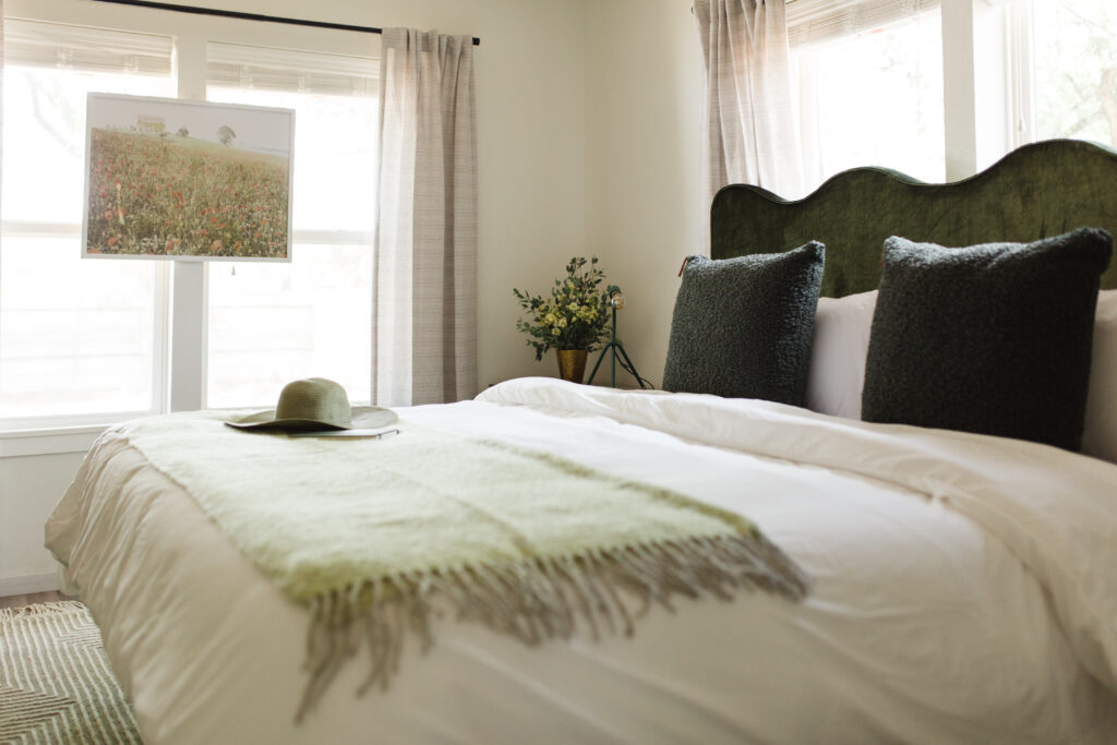
2. Monochromatic is a direction not a rule
Don’t get so focused on choosing colors within your monochromatic scheme that you rule out pieces that incorporate other colors. For some it’s more comfortable to have a hard set rule but you may miss out on some important depth that comes from pieces with a mixture of color.
When sticking to a monochromatic room design, try looking at the overall feel of the piece and whether or not it has a place in the design. For this second rule, I cannot emphasis enough the power of a design board with all the room elements on one page (click here for an example design board). This will help you weigh which pieces have the most impact to achieve the goal.
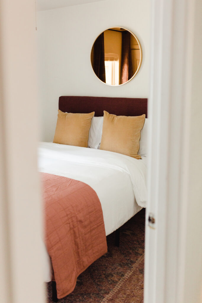
3. Mix textures!!
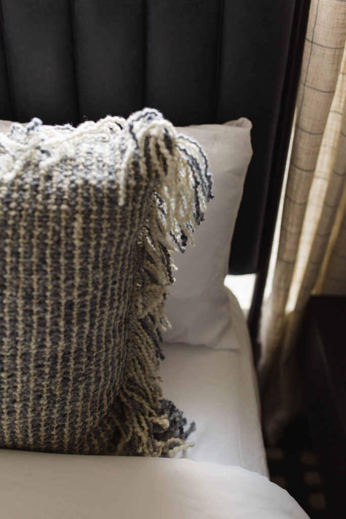
Using the same color throughout a room can fall flat. And if it does, I can almost guarantee it’s because the textures aren’t varied enough. You can even use two pieces that are identical in color yet distinguished in texture and they will actually create dimension in the space.
Another expert tip is to make sure you mix in some elements that are either ceramic or glass. These textures will catch the eye and will feel “wet” in the space. This tip is just an extra way to catch the observer’s eye as they roam the space.
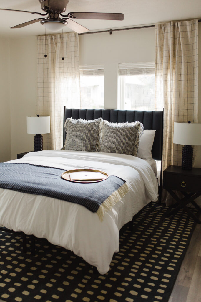
4. Have a hero
This is a rule for any designed room but it also applies to monochromatic spaces. A “hero” piece is something unique that immediately draws attention. If you have too many of these pieces, they can compete with one another taking away the overall impact.
The hero can be any element in a space – an accent chair, a headboard, art, or a rug. Just make sure the space doesn’t feel too busy when everything is together. Once again, this emphasizes the importance of a well planned mood board to ensure there is good design mix.
Now it’s time for you to put your own twist on these rules. You can choose to be bold by sticking with a tight color theme on every surface or just add a few pieces to a space within the same color tone.
Design should be fun and hopefully these rules help you branch out!
Sincerely,
HMD
Photography by Kaylynn Krieg Photography
This quarterly newsletter is our avenue to share home items we’re loving, tips and tricks we utilize to elevate our designs and the latest client homes we’re curating