HMD specializes on renovation projects that honor the home's character while adding a modern interpretation.
Explore The Blog
Home Rennovations
Do-It-Yourself
Home Styling
Favorite Things
Case Studies
Renovation Case Study: Bathroom Remodel

Location: Coppell, TX
Home type: residential home
Home square footage: 2,838
Project scope: bathroom remodel
Timeline: 4-5 months
Project Summary
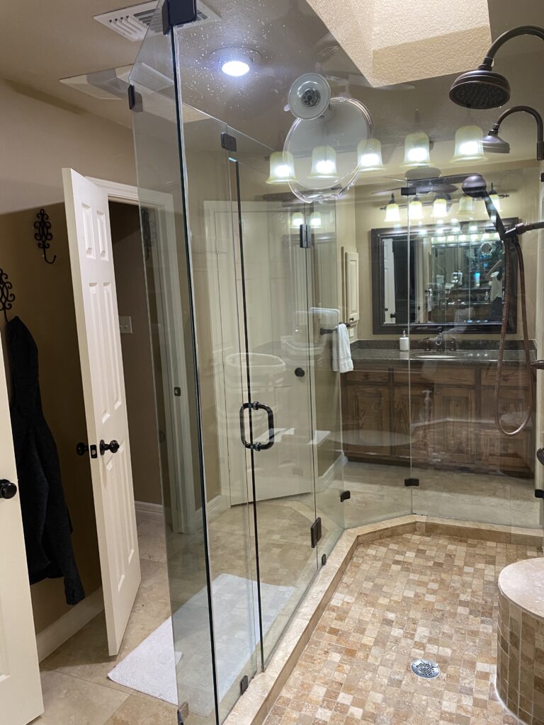
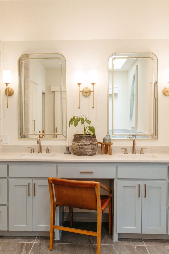
This project was for a bathroom that was stuck in the early 2000’s and allocated the space in a way that didn’t function for the homeowners. The majority of the bathroom was centered around an oversized, double head shower but the wife exclusively takes baths.
In addition, the room felt dark with the only natural light coming from a skylight and all the accent colors ranging in the darker beige family. Our main goal for this couple was to lighten up the space and to add a freestanding tub to the layout.
Before and After Photography
Below is where we began with the bathroom. It was very broken up with opposing vanities & closets on either side of the room. While having his & her spaces can be a luxury, the extra walls ate into the smaller square footage.


Design Concept
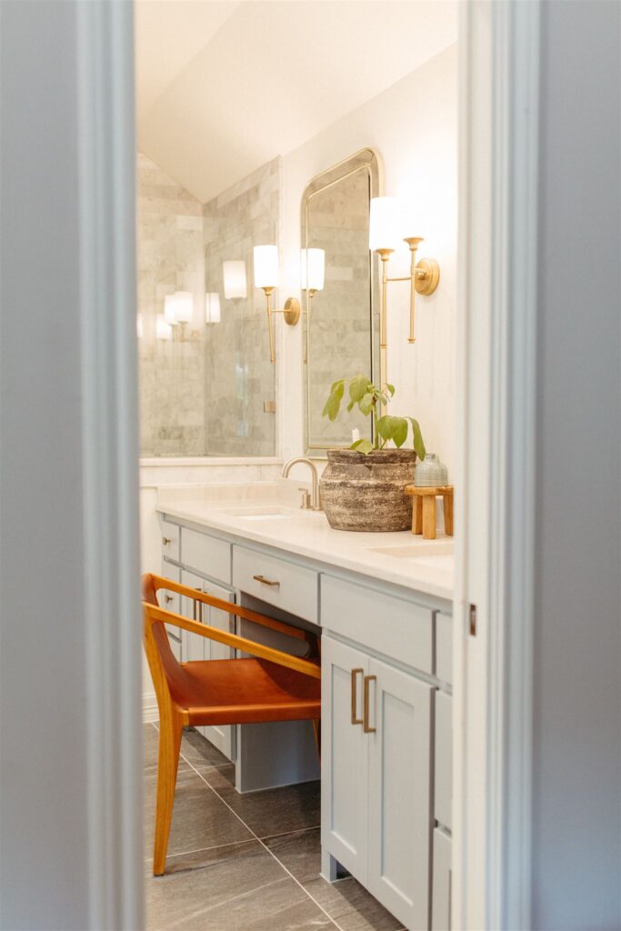
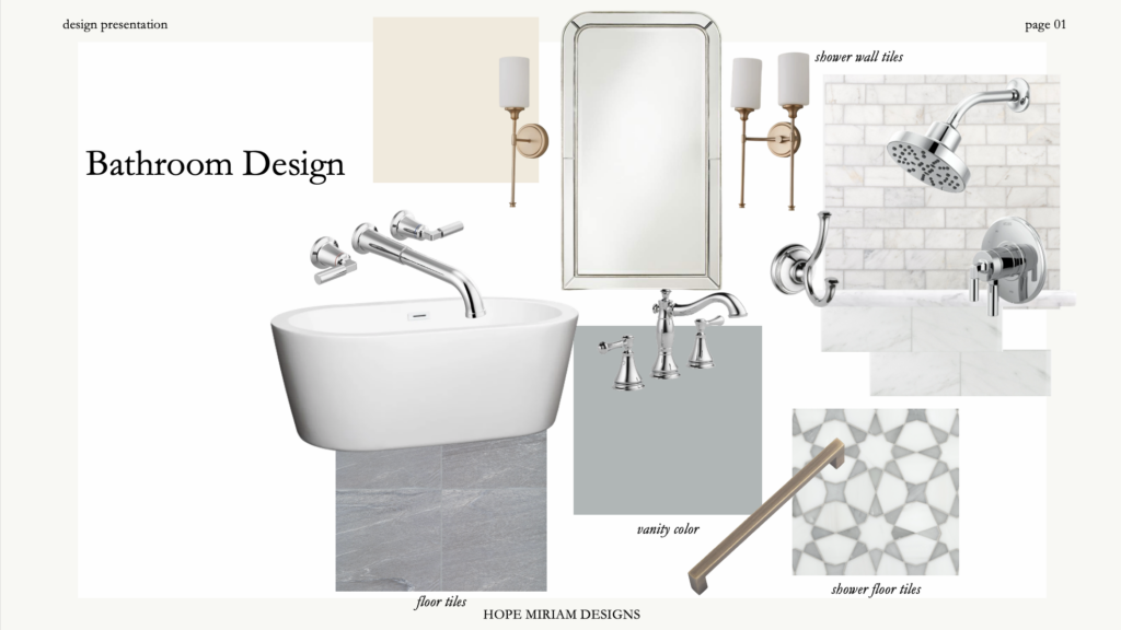
The goal of this bathroom was to use design elements that were timeless yet highly designed. We were able to achieve this through mixing chrome with bronze finishes and differing marble tile cuts. In the shower we used all marble subway tiles but smaller scale on the top half versus the bottom.
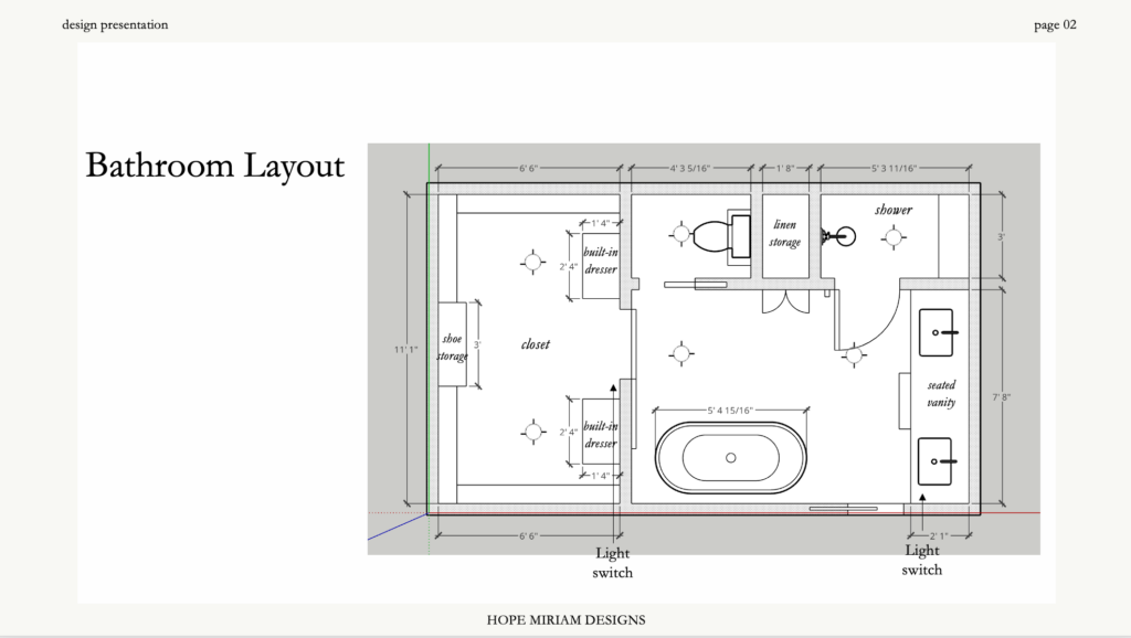
By removing some of the walls, we were also able to incorporate both a shower and a free standing tub. We strategically placed the tub under the existing skylight to give the piece a real moment in the space. In addition to rearranging the layout, we also raised the ceiling by a foot to make the room feel more airy and to help with the darkness of the initial space.
Common Challenges
The biggest hurdle for the space was creating differing functional spaces without the doorways crowding the space. It was still important for the homeowners to have a water closet and a door to enclose their closet. We were able to achieve this by utilizing a pocket door for the toilet room and a barn door to the closet with enclosed hardware. This space has an elevated style so by encasing the hardware on the barn door it gave it an upscale, hotel look instead of rustic farmhouse.
Another element we needed to tackle was lightening the space. As mentioned earlier, we were able to raise the ceiling about a foot throughout the space which not only helped with opening the space but also helped incorporate extra storage with floor to ceiling shoe shelves in the closet. We intentionally chose a color palette of warm whites and marbles so the surfaces would reflect the natural light coming from the skylight.
Curious about learning more for your own bathroom renovation? Fill out a contact form and let’s talk!
Sincerely,
HMD
This quarterly newsletter is our avenue to share home items we’re loving, tips and tricks we utilize to elevate our designs and the latest client homes we’re curating